a deep dive into creating a conversion algorithm for chart images to tactile display pin-matricies
Simplified write-up of a manuscript in preparation.
The problem - 552,960 pixels in, 2,160 bits out
A refreshable tactile display presents a grid of physical pins that are either raised or flat. For this research we will consider the grid to be 36 rows and 60 columns. A chart image at 960x576 carries 552,960 RGB pixels. The conversion therefore becomes both a spatial compression at 256:1, and each output is a single binary decision (bit). Without the option for a grey decision halfway between a raised or lowered pin, and no zoom options, every individual decision is important and felt. Note throughout this post I will refer to a 16x16 patch of pixels as a 'block' - this simply means each patch of pixels that is converted to one decision.
A few error cases to keep in mind whilst reading: (i) thin lines - a 2 pixel thick line crossing a block makes up only an eighth of its area. (ii) chart 'chrome' - put simply the 'extra information' on the graph, which would include axes, tick marks and frames, which are all high contrast and typically in the same colour/thickness as the true marks. (iii) reliability - a per-image guarantee on missed data is essential, as considering practical applications, we can easily see how missing data on a chart can distort a user's perception.
Prior art and the one non-classical step
Image and document binarisation is an old problem, and well-documented: Otsu's global threshold selects the grey level that maximises between-class variance (Otsu 1979); adaptive methods threshold against a local statistic (Sauvola and Pietikäinen 2000); edge detection offers structure without fills (Canny 1986); mathematical morphology repairs binary masks (Serra 1982). The algorithm that is proposed shortly adopts two of these: Otsu's method and a 3x3 morphological closing.
The one non-classical feature in the proposed algorithm is the feature that the threshold operates on. Grayscale conversion has an isoluminance (when the colour of the chart contents is of a similar luminance to the background) failure mode. Instead, I compute (per pixel) the maximum absolute deviation from the estimated background colour across R, G and B. In this scalar field, chart ink of any colour appears 'bright', mitigating the failure case.
Ground truth
Another important step in the setup of this project is defining a reliable ground truth from which to measure error. You cannot measure a binariser without per-cell labels. My approach to this was to procedurally generate charts from known parameters, and then the ground truth mask is painted from the same vector geometry of the known parameters, onto a 960x576 canvas with PIL. Axes, ticks and labels were not painted. A cell's ground truth is positive (meaning a raised pin) if and only if more than 5% of its 256 pixels are ink. It is important to note at this point, that the later mentioned aggregation threshold 'a' used in the algorithm is a separate constant (and making this mistake in the code cost me an embarrassing amount of time).
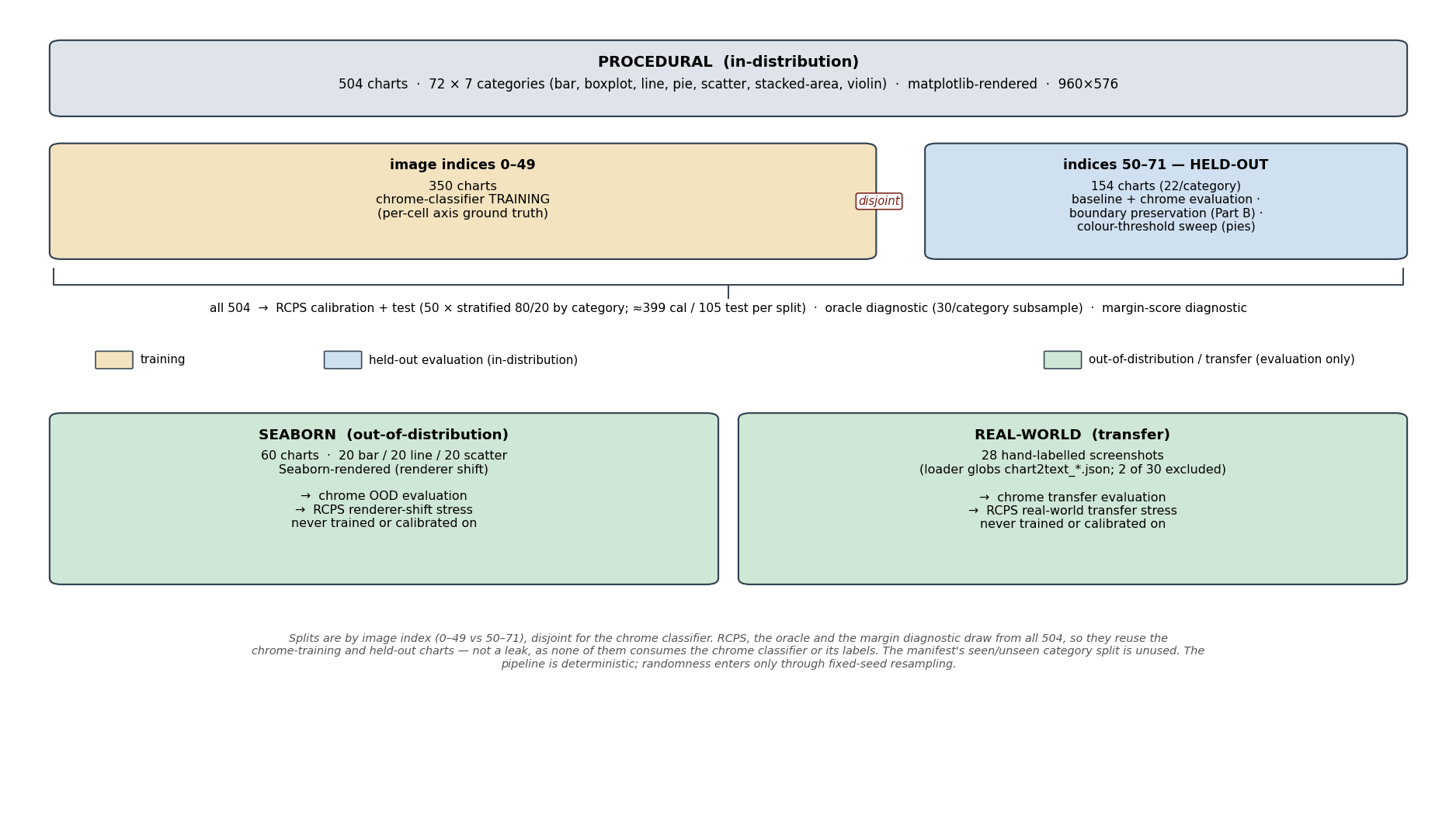
The corpus of charts used for tuning and testing is made up of 3 separate sub-corpora. The first is procedurally generated in Matplotlib (504 charts), the second is rendered in Seaborn (60 charts), and the third consists of 28 hand-labelled screenshots from real-world charts.
The baseline algorithm
Now for the more interesting part - the baseline algorithm that error is evaluated against:
- Background estimation - take the per-channel median over four 28x28 corner patches - the 'background' is defined as whatever colour dominates the corners.
- Deviation map - per-pixel channel-max deviation from that background
- Canvas Normalization - inputs are resized onto the 576x960 working canvas
- Otsu + closing - global threshold on the deviation grid, then one 3x3 binary closing
- Cell aggregation - a pin raises if a fraction 'a' of its 256 pixels are foreground. This constant 'a' is the single most consequential constant in the system.
The algorithm also includes a per-cell margin score (which is just one minus the normalised distance between the cell's strongest pixel and the Otsu threshold). So a high score means the cell's strongest pixel sat close to the Otsu threshold: the decision was a near thing, and the score is best read as an uncertainty measure.
def margin_score(dev_grid: np.ndarray, threshold: int,
                 cell_px: int = CELL_PX) -> np.ndarray:
    h, w = dev_grid.shape
    rows, cols = h // cell_px, w // cell_px
    out = np.zeros((rows, cols), dtype=np.float32)
    denom = float(max(threshold, 255 - threshold, 1))
    for r in range(rows):
        for c in range(cols):
            block = dev_grid[
                r * cell_px:(r + 1) * cell_px,
                c * cell_px:(c + 1) * cell_px,
            ].ravel()
            margin = min(abs(float(block.max()) - threshold) / denom, 1.0)
            out[r, c] = 1.0 - margin
    return out
Eventually, after some tuning (which is explained in the next sections), the algorithm starts making satisfactory conversions as such:
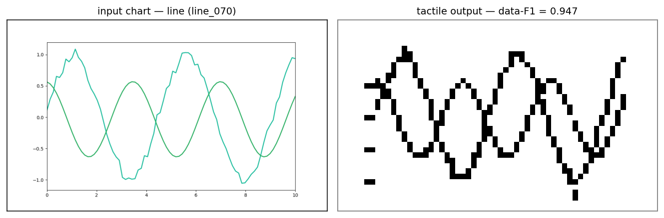
At this point, it is also relevant to note that all alternatives were eliminated before fine-tuning, as grayscale Otsu was already the strongest method for this task. The result of adding the deviation and closing steps is also evident, as the F1 score on test-set data increased from 0.783 to 0.912.

Error cases and fixes
Measuring what is fixable by letting a model 'cheat'
I trained a gradient-boosted classifier for every individual chart type (e.g. scatter, bar etc.) to represent the recoverable floor for error. The classifier represents (for each chart type) the minimum amount of recoverable error from a better decision rule - logically, the classifier sees the same 16x16 block as the algorithm, and so any accuracy it achieves should be achievable by the algorithm. The immediate question would be to ask why I did not just use the classifier instead of the algorithm. The reasoning is simple: there is an individual classifier per chart type, so the algorithm would have to include some way of identifying the type of chart, but more importantly, it would mean that the algorithm could not generalize to all types of charts - concretely, if a chart type showed up that was not represented by an individual classifier, the algorithm would not be suitable for its conversion.
This experiment showed empirically that there were varying levels of headroom between the algorithm's decision rule, and the minimum recoverable error. Furthermore, comparing the results of the experiment to relevant chart statistics, it became obvious that headroom is strongly correlated with the percentage of chart ink that is chrome (r = 0.857, p = 0.014).
The solution for removal is now clear - remove chrome from the chart as a preprocessing step. I initially trained a classifier for chrome detection, but quickly discovered that it just memorized layout - which became obvious as the classifier failed as renderer type switched from Matplotlib to Seaborn. The solution (for both the minimum-recoverable-error classifier and the chrome classifier) was a layout invariant classifier. The classifiers were given hand-engineered features instead, consisting of the pipeline's own uncertainty, the cell state, local density at two scales, row density, column density and the gradient of the pin grid. The bet here is that axes reveal themselves structurally - a full-length run of raised cells in an otherwise sparse row is an axis wherever it sits on the image.
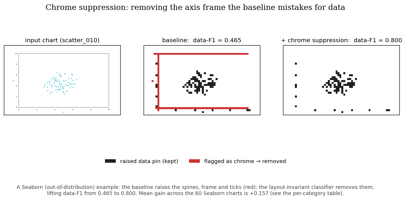
Averaged results per corpus also show a promising positive, which has its greatest effects outside of distribution:

Avoiding the metric punishing an important feature
Binarisation erases colour, and with it the conceptual boundary between two adjacent filled regions of different colours. A pie chart becomes one raised disc, which achieves a near-perfect F1 score. So the method is both statistically perfect and tactually useless? This exposes a clear issue with the use of only F1 score in this context. Instead, to represent this issue, a 'connected-component count' is introduced, simply defining the number of blocks of adjacent raised pins. The solution is equally simple, as we can insert 'gap pins' - pins which cannot be raised, placed between two neighbouring raised pins, where underlying mean cell colour differs by more than 60 (although any colour threshold from 40-80 was found to be equally suitable).
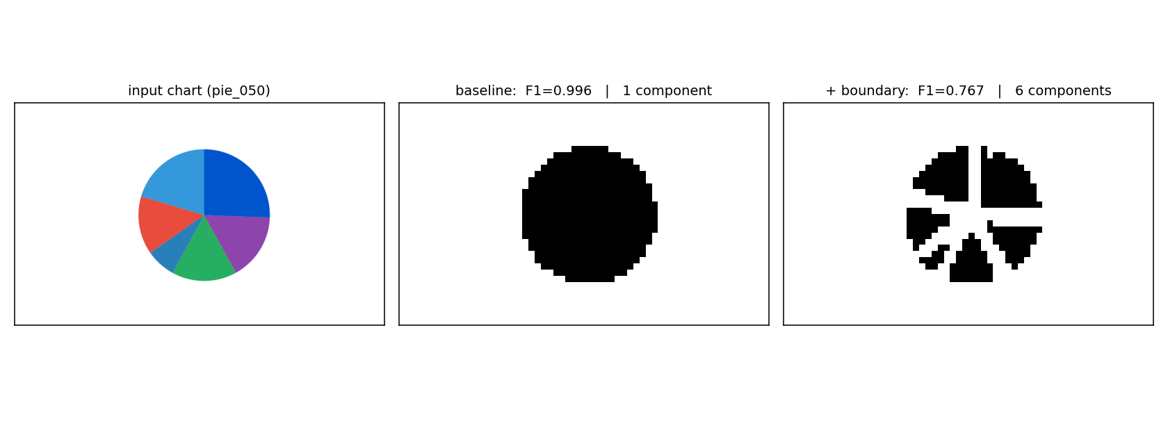
An issue with this method is that it has very distinct and harmful error cases. For stacked-area charts, the average F1 score cost is just over 0.4, as gradient fills and shared boundaries generate excessive gaps. In a deployed version of the system, as a result, the 'gap pin' method should only be applied to relevant charts such as pie charts.
The risk of silent error
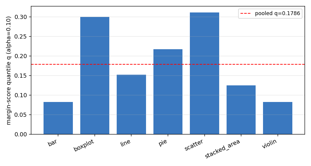
The most relevant failure mode on a tactile display is a silent deletion (e.g. a pin left flat where the chart has potentially significant data). This makes the target metric for this section the false negative rate (FNR) - what fraction of true pins the system misses. The obvious move is to hand-pick a confidence cutoff on the margin score. This is not a good idea - the score means very different things for different chart types.
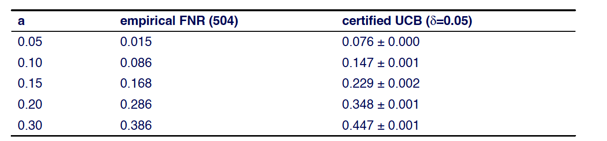
The alternative is a certificate. The parameter controlling misses is the aggregation threshold 'a' itself, so we can calibrate it with Risk-Controlling Prediction Sets (Bates et al. 2021). The recipe: measure per-image FNR at each candidate a on a calibration set, add a concentration penalty sqrt(ln(1/d)/2n) for having only n samples, and you may claim (with 95% confidence) that the true expected miss rate stays under the total. This produces an 'Upper Confidence Bound' (UCB).
I also built Mondrian (per category) calibration due to the large spread in the margin score quantile across categories. Mondrian calibration returned near-identical bounds, so there was no gain to justify adding a category-dependent constraint. This returns to the logic about keeping the algorithm functional on all chart types.
Takeaways
- Look at several metrics for the same issue - oftentimes they can help gain a better understanding of the real usefulness of the system, and in this case I was able to use metrics like the recoverable headroom classifier to lead me directly to a solution.
- Ensure solutions can generalize - throughout this project, I often walked into traps where the system would not have been able to generalize properly, or would be constrained to only a handful of classes. Mitigating this with intelligent solutions was both a rewarding academic task and good practice.
Referenced papers for further reading
Otsu, N. (1979). A Threshold Selection Method from Gray-Level Histograms. IEEE Trans. SMC 9(1).
Serra, J. (1982). Image Analysis and Mathematical Morphology. Academic Press.
Canny, J. (1986). A Computational Approach to Edge Detection. IEEE TPAMI 8(6).
Sauvola, J. & Pietikäinen, M. (2000). Adaptive document image binarization. Pattern Recognition 33(2). (Benchmarked lineage; the deployed pipeline uses a global threshold.)
Bates, S., Angelopoulos, A., Lei, L., Malik, J. & Jordan, M. (2021). Distribution-Free, Risk-Controlling Prediction Sets. JACM 68(6).